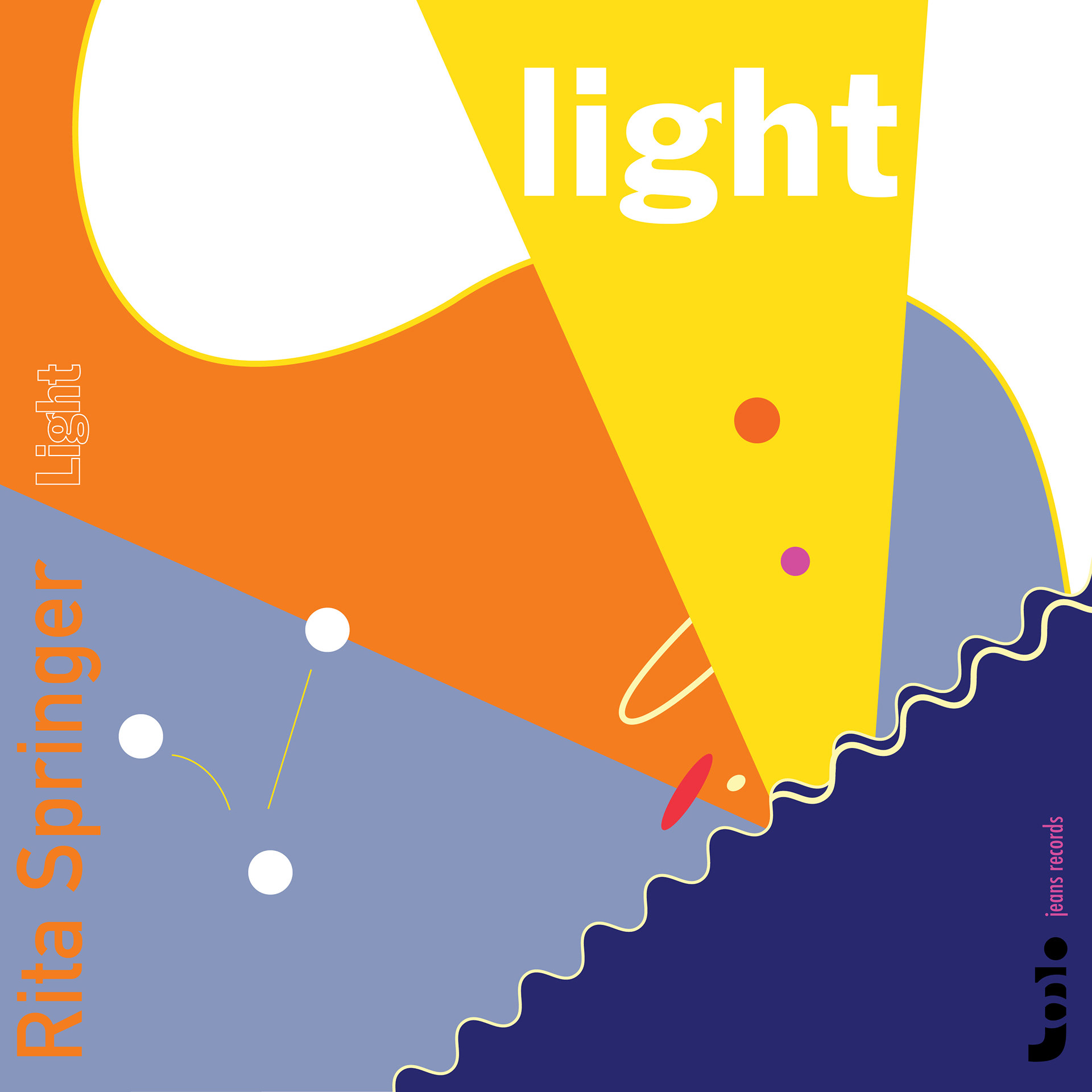
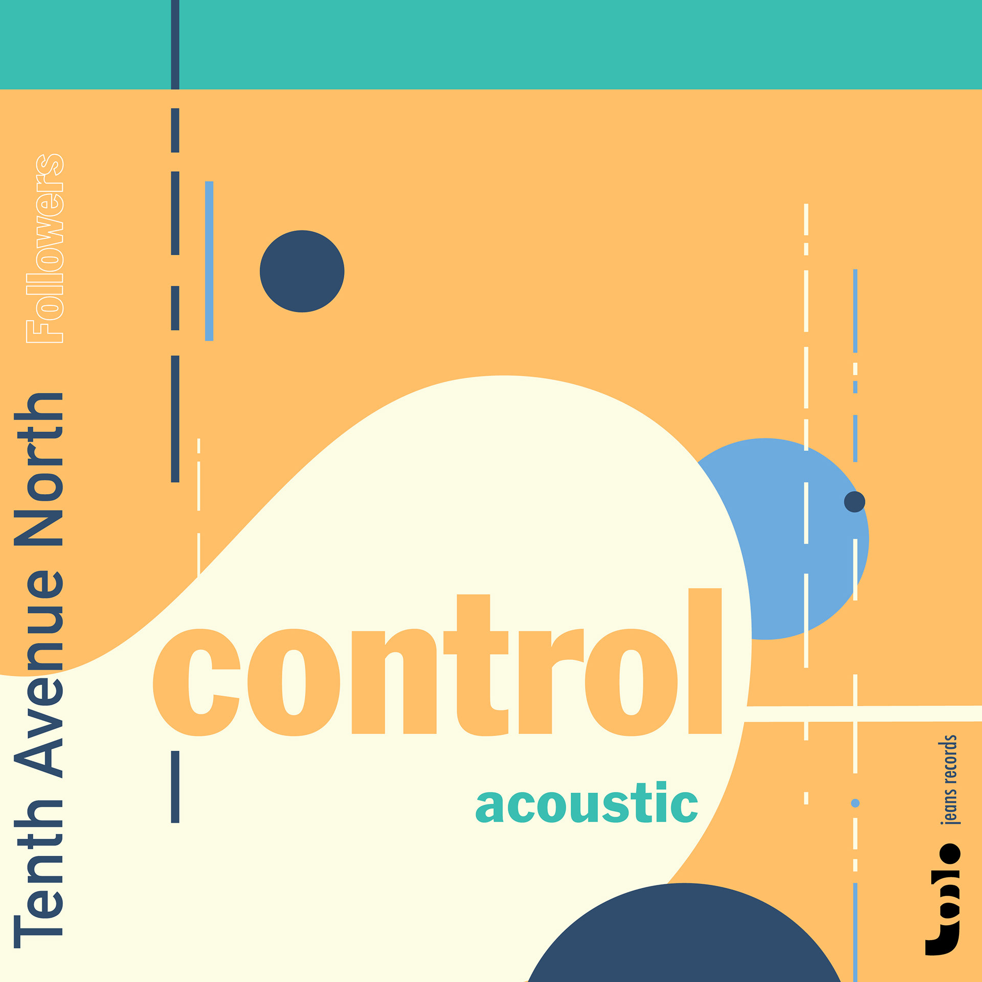
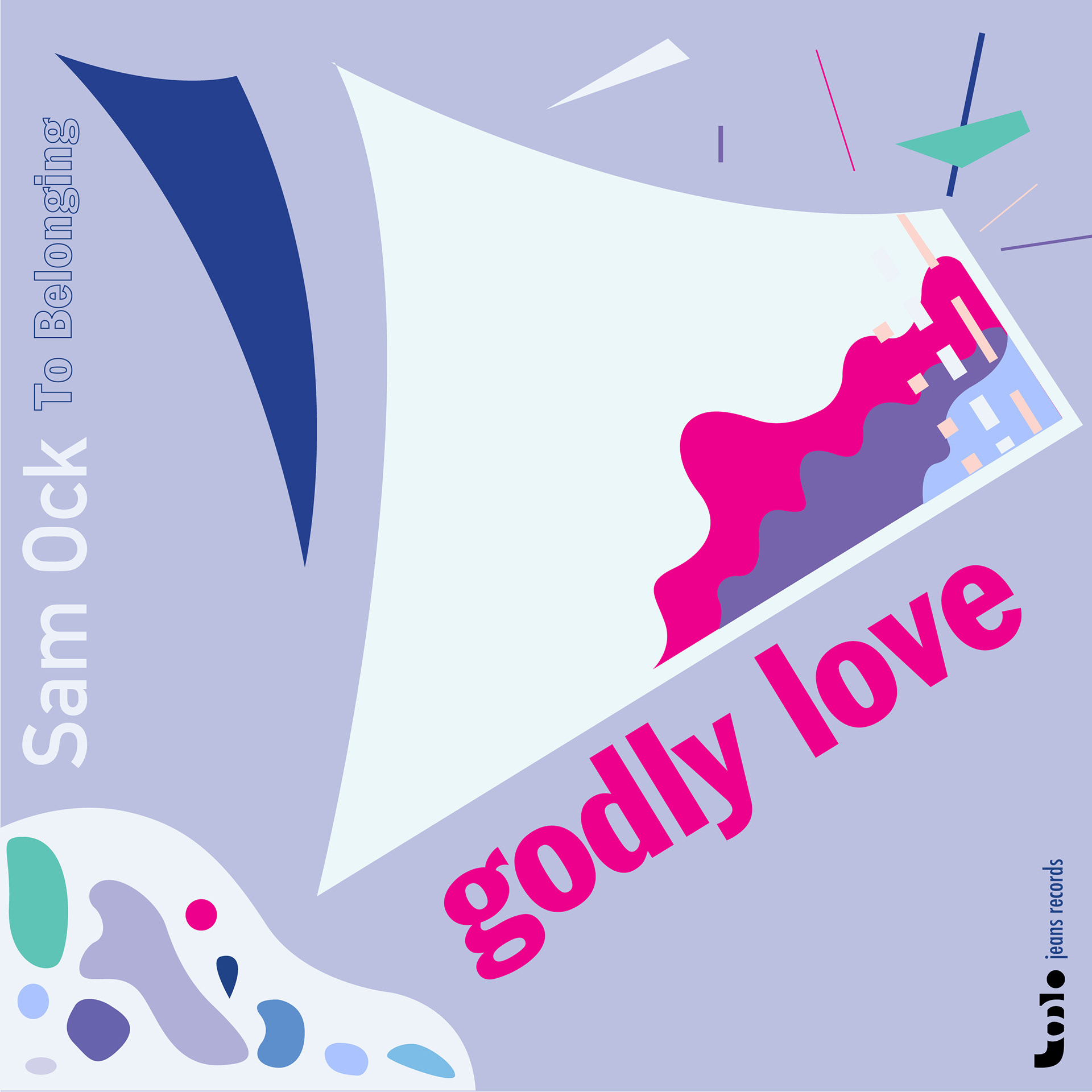
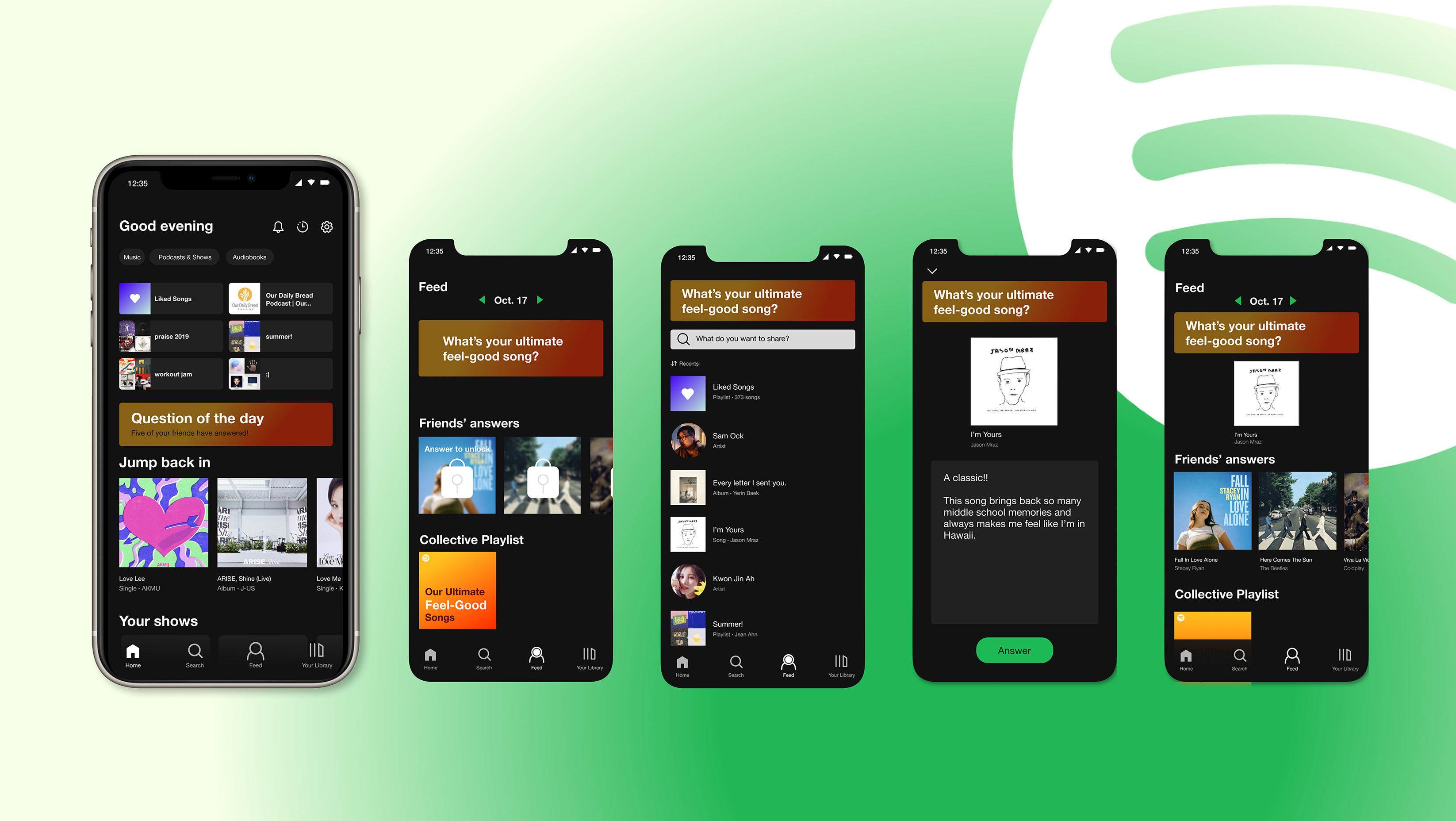
The objective of this project is to design three album covers for three songs. The musical pieces are very distinct in their genres and feel. After listening to the 3 pieces over and over, I created a sketch which was then converted digitally.
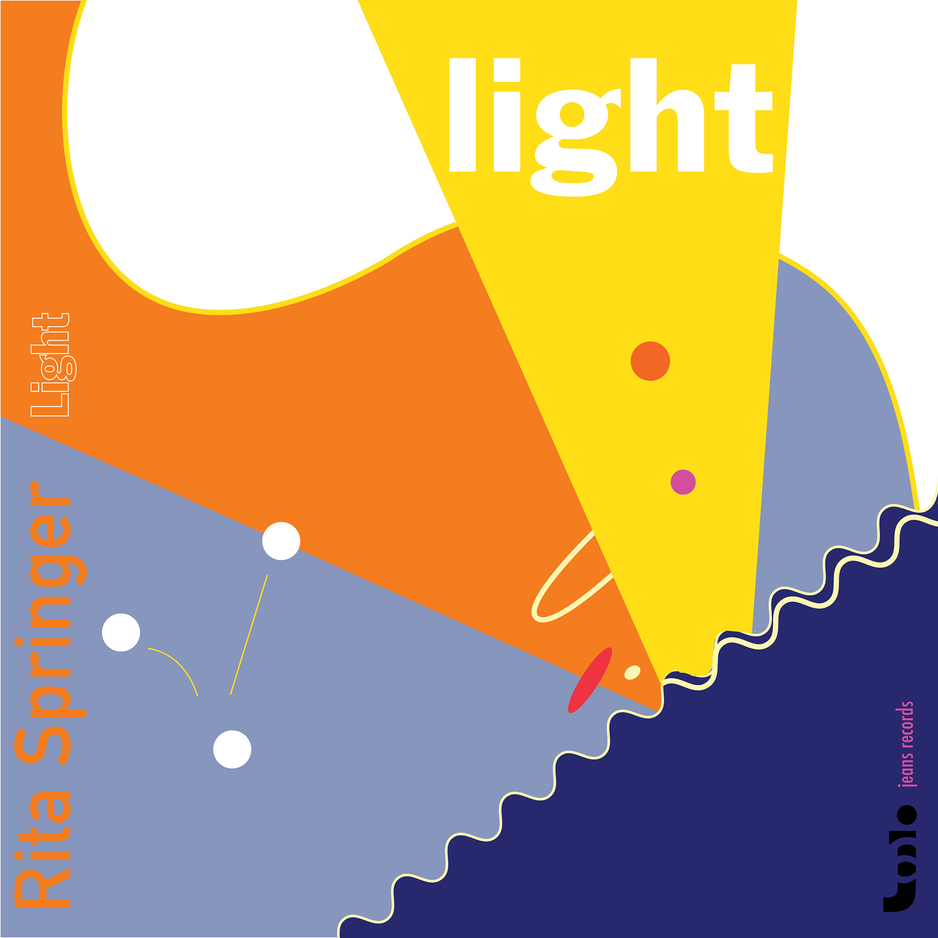
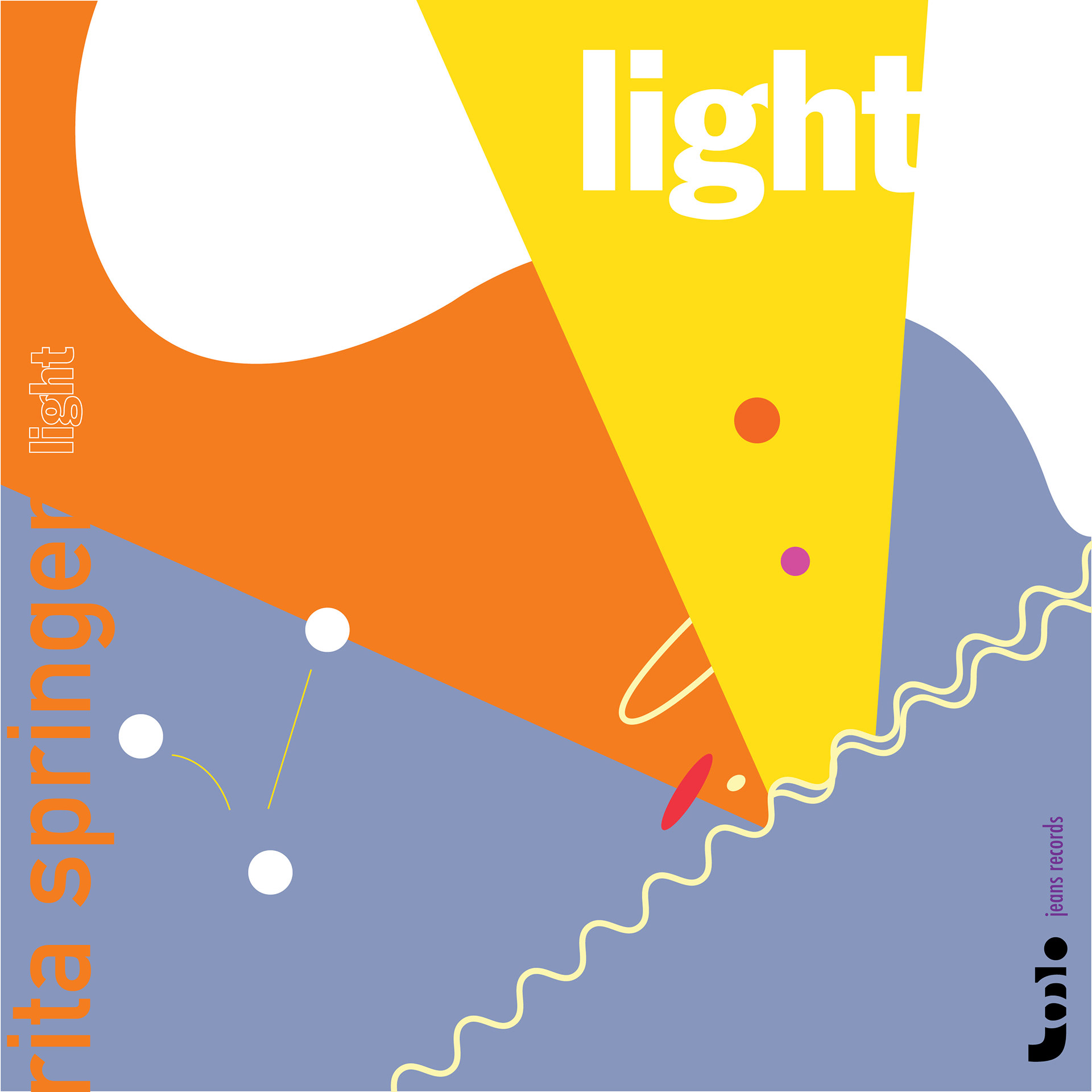
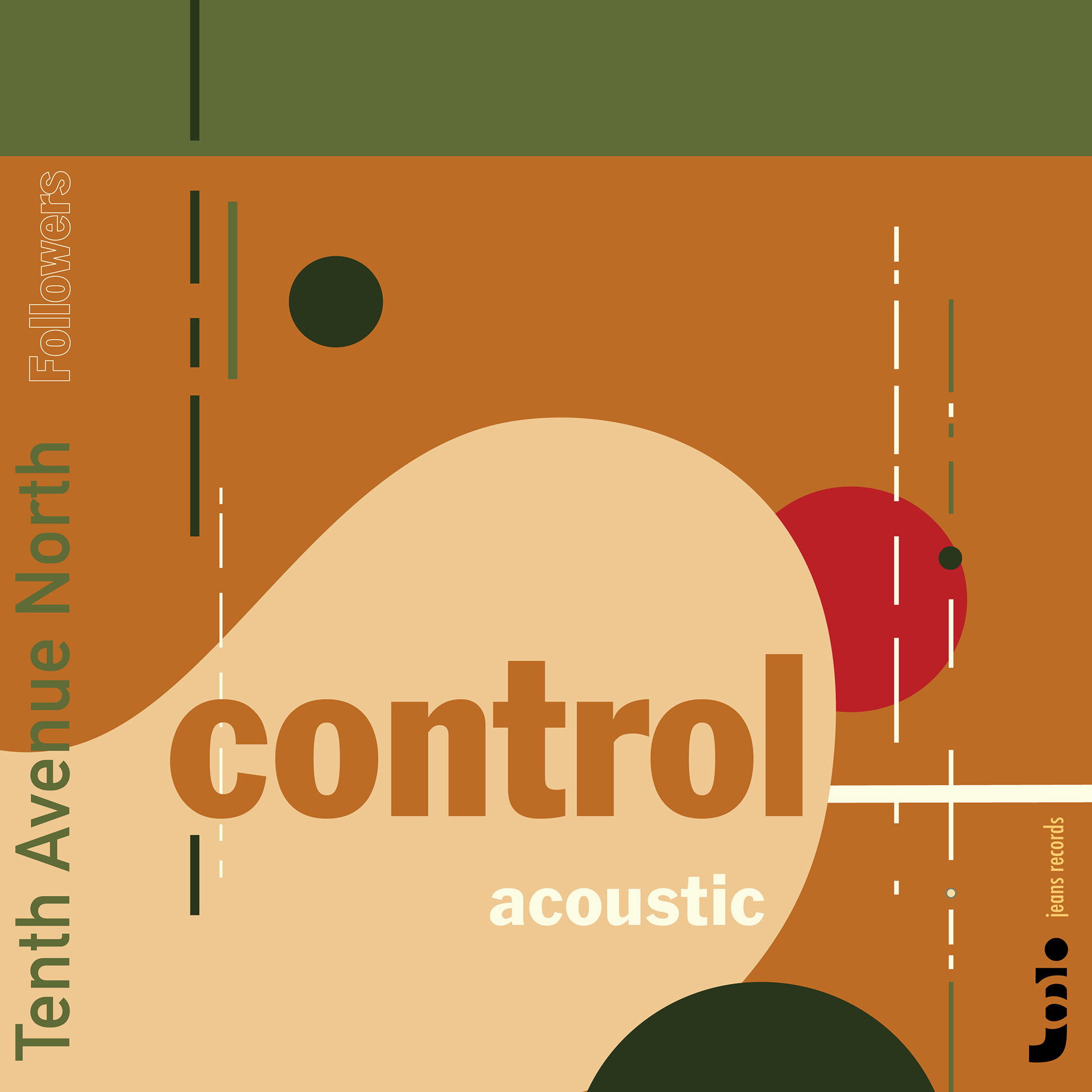
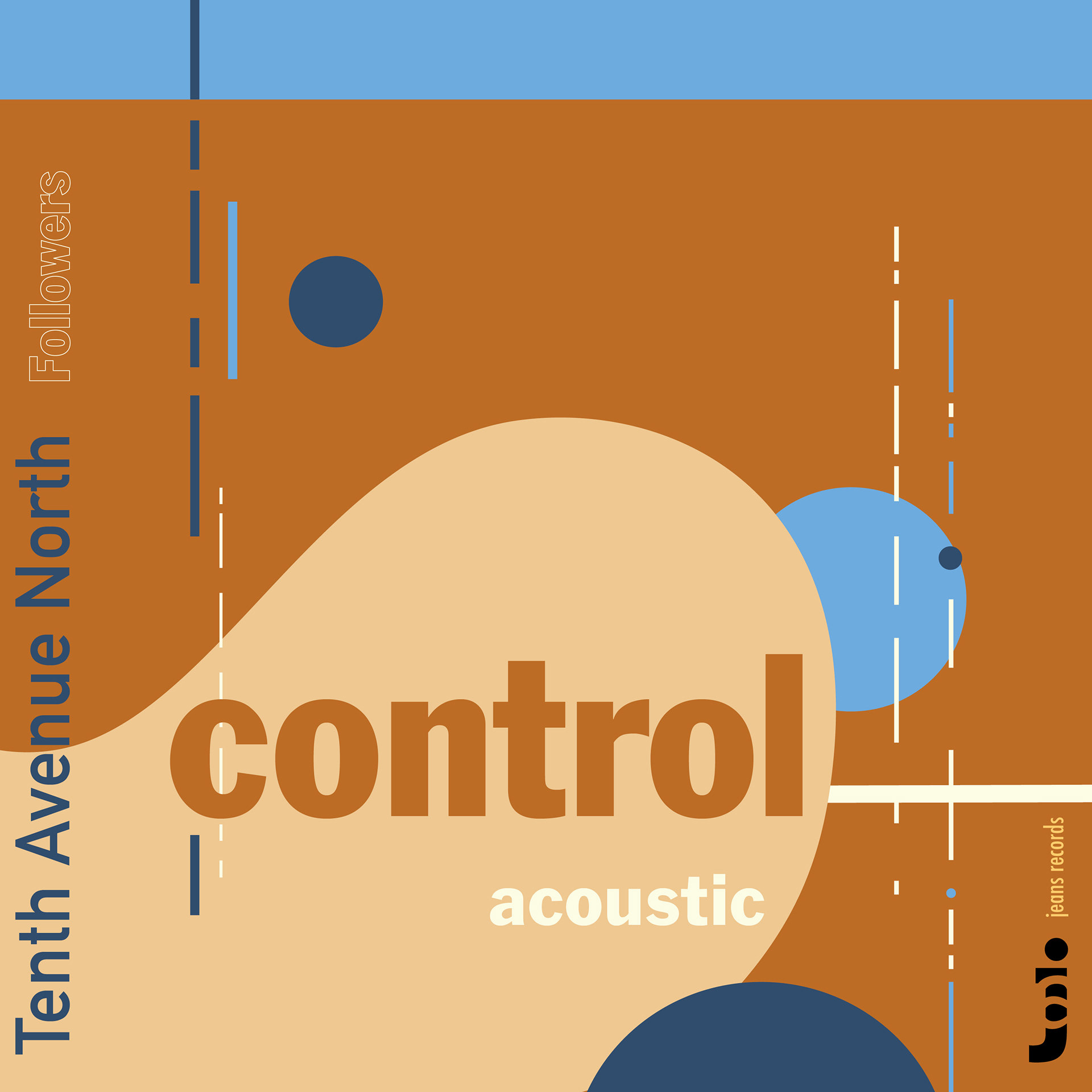
Final Design
Typefaces: Franklin Gothic, DIN alternate, Futura
Typefaces: Franklin Gothic, DIN alternate, Futura
Process
1) Album Cover Research
Before designing my album cover, I researched designers who specialize in album cover design.
• S. Neil Fujita
• Josef Albers
• Reid Miles for blue note
• Rudolph de Harak
• Peter Saville
• Barney Bubbles
• Vaughan Oliver
• Alex Steinweiss
• Jim Flora
• Erik Nitsche
• Emmett McBain
Before designing my album cover, I researched designers who specialize in album cover design.
• S. Neil Fujita
• Josef Albers
• Reid Miles for blue note
• Rudolph de Harak
• Peter Saville
• Barney Bubbles
• Vaughan Oliver
• Alex Steinweiss
• Jim Flora
• Erik Nitsche
• Emmett McBain
2) Song Digestion
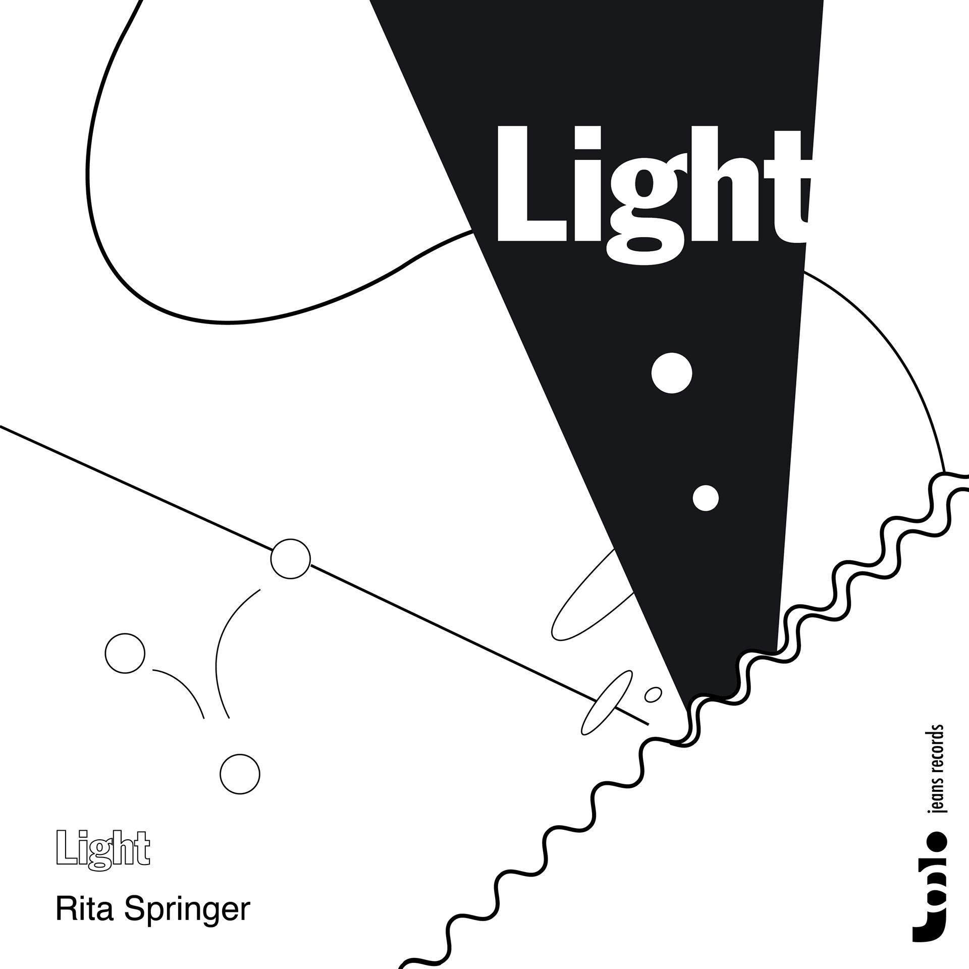
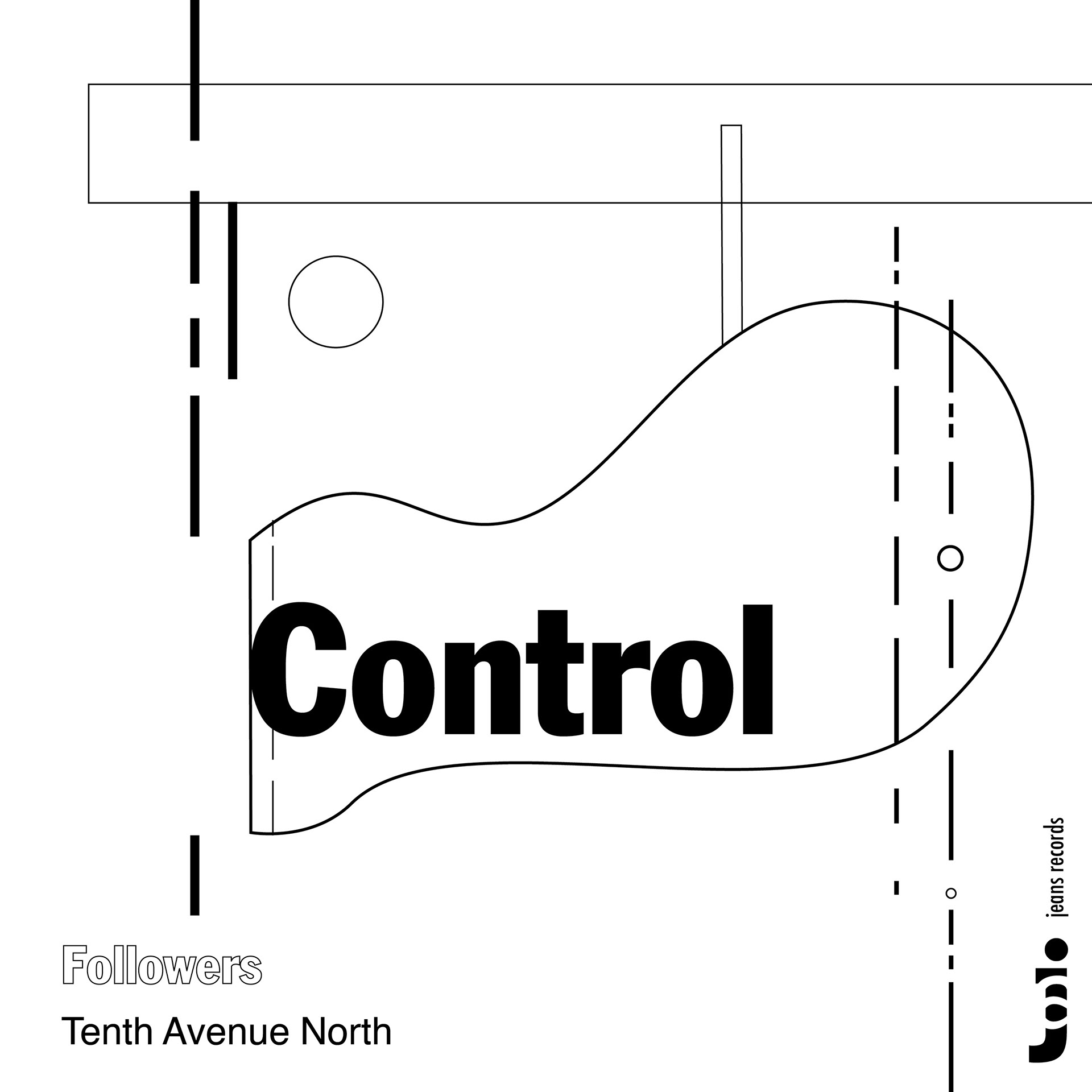
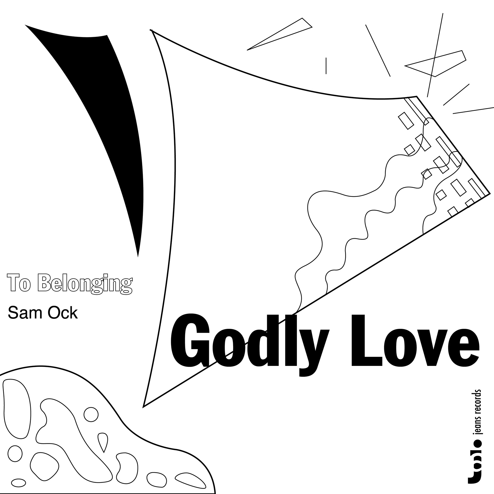
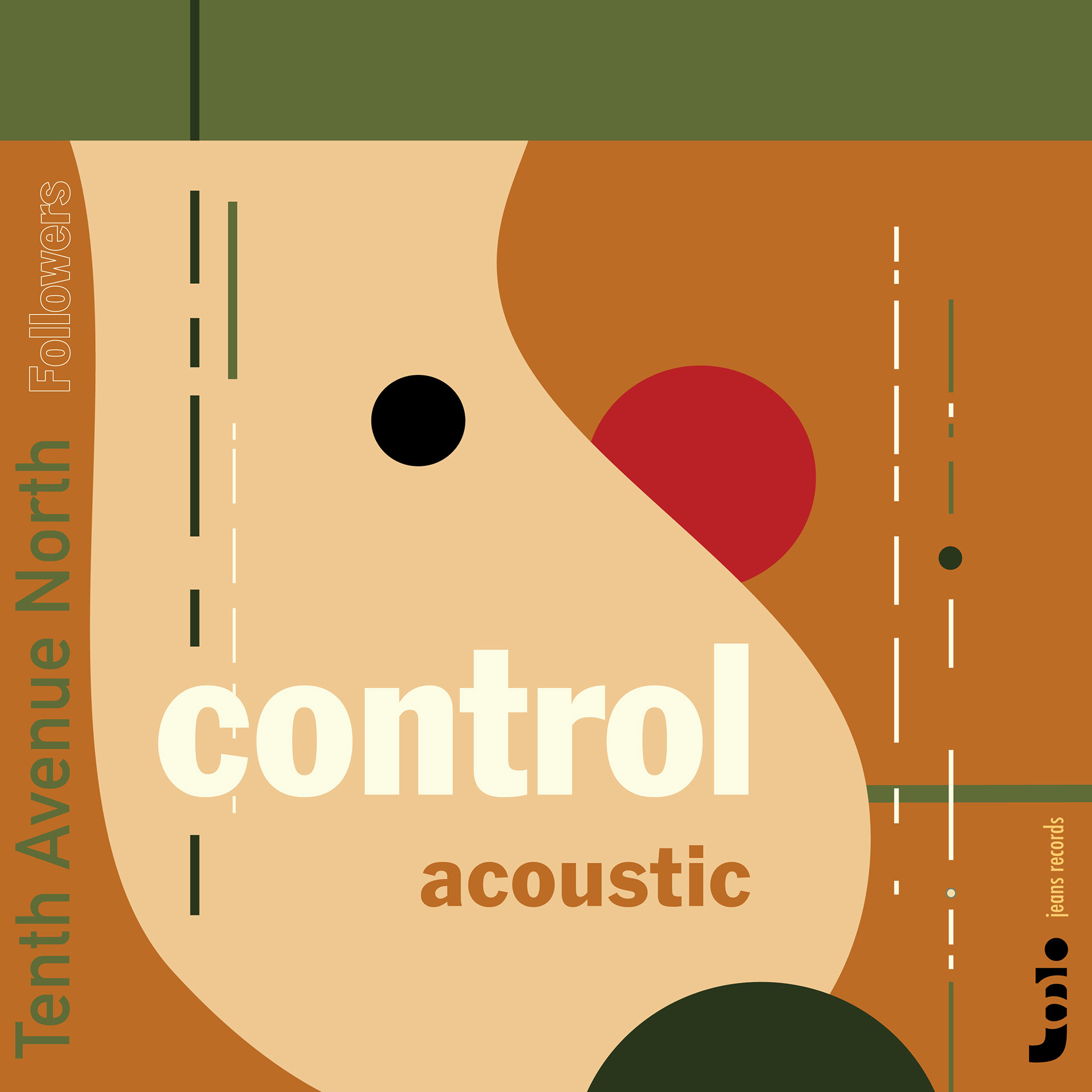
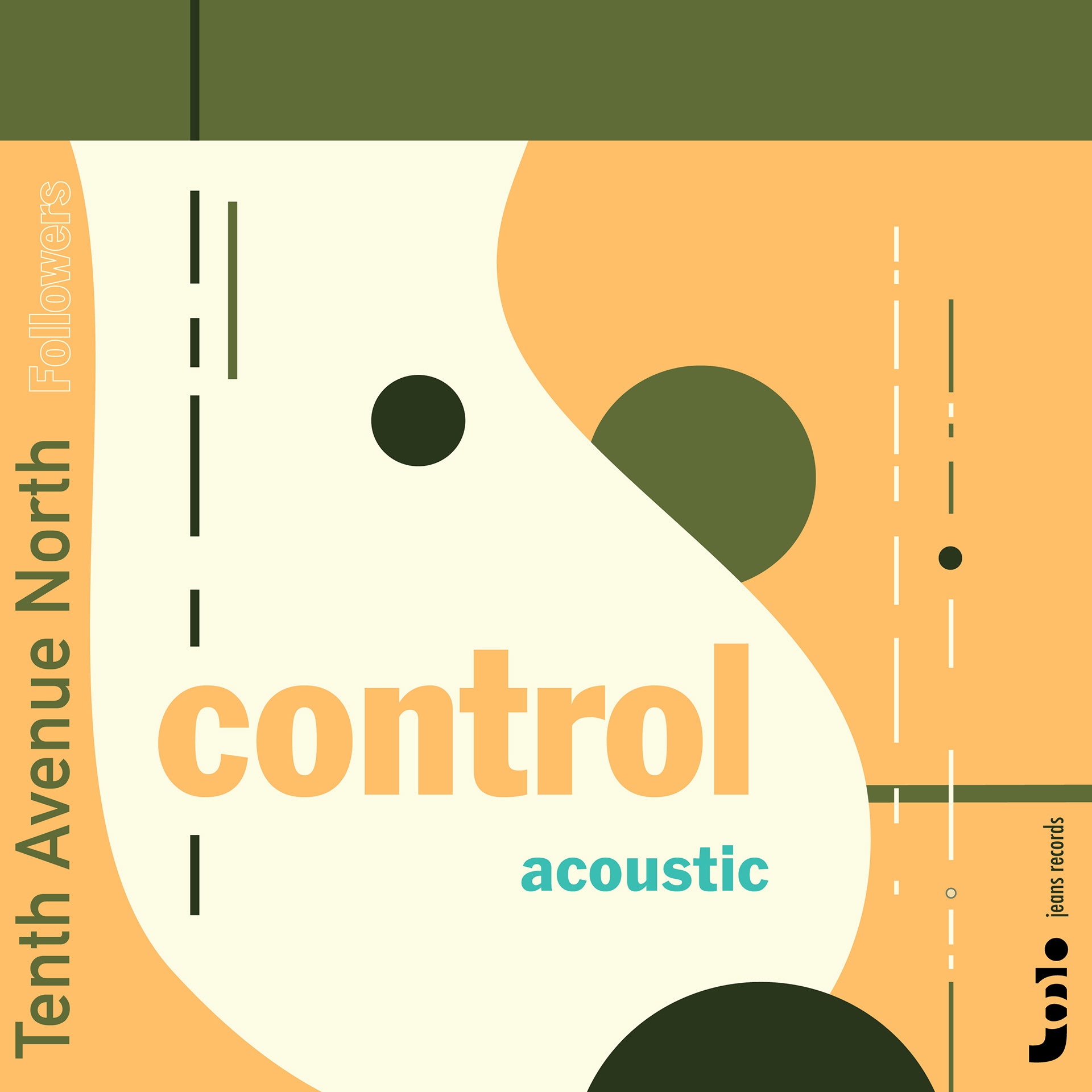
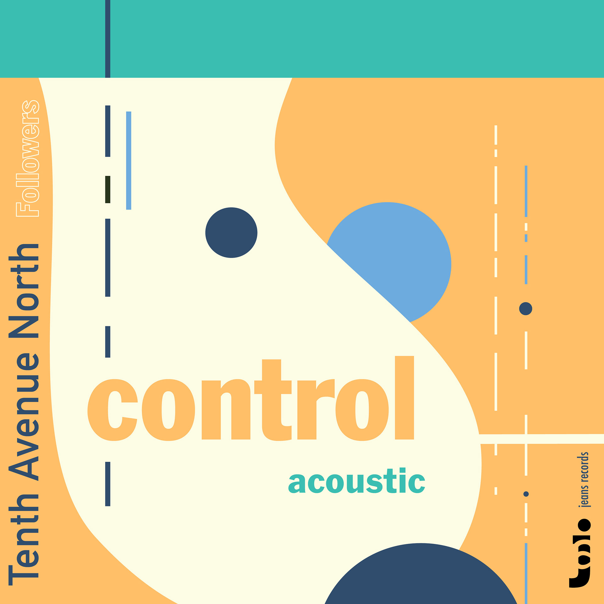
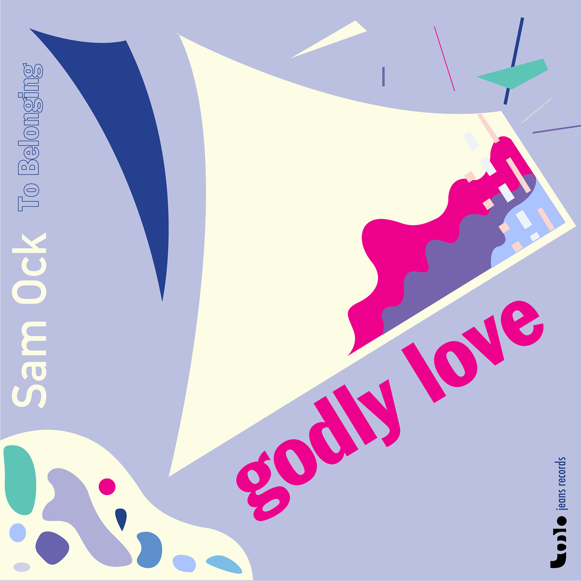
Then I chose three of my favorite musical pieces of different genres. I chose "Light" by Rita Springer, "Control (Acoustic)" by Tenth Avenue North, and "Godly Love" by Sam Ock.
Then I chose three of my favorite musical pieces of different genres. I chose "Light" by Rita Springer, "Control (Acoustic)" by Tenth Avenue North, and "Godly Love" by Sam Ock.
All three songs are very different as "Light" gives a pop-song feel and has dramatic parts while "Control (Acoustic)" is calm and quiet, almost like a country song. "Godly Love" is similar to "Light" in that it also gives a pop-song feel; however, it also has a rap component and a choir component, making the piece very dynamic.
To fully digest the songs, I listened to each song on repeat. I listened to them in full blast and then in small volume, trying to capture all the detailed components of the songs.
3) Abstraction
Listening to the 3 pieces of music, I hand-sketched some geometrical and abstract shapes that represent the "feel" of the songs.
Listening to the 3 pieces of music, I hand-sketched some geometrical and abstract shapes that represent the "feel" of the songs.
4) BNW Drafts
I digitally converted my sketches to first create an outline only using black and white. I also added my personal mark for the record label and used "jeans records" for the label name.
I digitally converted my sketches to first create an outline only using black and white. I also added my personal mark for the record label and used "jeans records" for the label name.
4) Color Drafts
I created multiple versions with varieties of color palettes while focusing on using "pop colors" to make the overall design more dynamic.
I created multiple versions with varieties of color palettes while focusing on using "pop colors" to make the overall design more dynamic.


5) Final Designs
